An interesting feature that’s not immediately noticeable: This piece features Malachite and Aventurine embedded within the work. Malachite, with its rich green bands, stands out in size and depth, creating natural, raw brush marks. It carries a history, having been used from ancient Egypt to Renaissance frescoes to evoke an earthy, vivid green. I’m drawn to Malachite because it resembles wet brushstrokes frozen in time, adding weight and grounding the piece in both art and nature.
Aventurine, by contrast, is smaller and subtly embedded within the glass. Its shimmer is delicate, revealed gradually as the viewer spends more time with the work. Historically used in mosaics and ornaments, Aventurine’s soft glint adds a hidden, quiet depth. I wanted these materials to speak, layering into the piece to evoke a sense of history, color, and materiality. The work becomes a conversation between the visible and the sensed, bridging past and present.
How it reflects your practice as a whole: This piece reflects my overall practice through its monochromatic palette and emphasis on light. My work often delves into color perception, and I’ve developed a series of tonal paintings that highlight the nuances within a single hue. Here, I chose green—a color I previously avoided but now engage with to explore its depth and natural associations.
The inclusion of glass and mirrors emphasizes the role of light in how we perceive color. These materials reflect and refract light, interacting with the environment to create a dynamic experience that shifts with changes in light and viewer movement. This work invites viewers to see color as fluid and responsive, shaped by light and perception. Ultimately, it explores the intersection of color and light, aiming to challenge perceptions and deepen sensory engagement with the world around us.
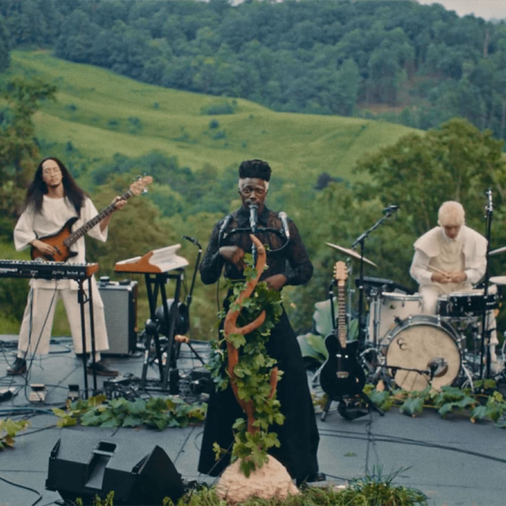
One song that captures its essence: “Afterlife Residence Time” by Immanuel Wilkins.


